Case Study: Mentor on Demand
Disclaimer, this project is part of the Virtual Internship Program: Professional Academy DTS Kominfo Batch 3–2022: UI/UX Design Mastery (Intensive Class). Skilvul is the Challenge Partner.
Overview
Skilvul is a technology education platform that provides digital skills lesson content with the “blended-learning” method online and offline. Online courses or bootcamps generally have a high mentee-to-mentor ratio, which limits the mentor’s ability to communicate with one mentee at a time. Due to this, mentees often feel they aren’t fully guided.
Skilvul wants to make and introduce a feature that is related to one-on-one mentoring. If you see that there are still not many mentoring services on the market. Therefore, we made this case study to get validation of the problem as well as a solution.
Role in The Team
In this project, I collaborate with four other members of the team, Sri Fersney Hedwinanto, Wanvy Arifha Saputra, Sabo Hermawan, and Ade Prasanto.
As a UI/UX Designer, I helped my team to take care of the consistency of the design, created a visual design, and also helped them create the design system. I also conduct digital wireframing, high-fidelity, and prototyping.
Tools
The following is the software that we used in the case study:

Design Process
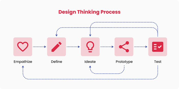
As a guide and tool in this process, we used the design thinking framework. In design thinking, we approach problems from a solution-based perspective.

Phase 1: Empathize
The purpose of empathizing is to gather a deep understanding of user needs. Our team conduct a secondary research.
We conduct secondary research by performing Competitor Analysis, collecting user feedback from the App Store and Play Store from similar applications, and making resumes from AMA sessions with Challenge Partners.
Full secondary research results: https://bit.ly/3C72G89
Phase 2: Define
User Persona
- 15–40 years old
- Work as a student/employee
- Domiciled throughout Indonesia
- Have good articulation in communication
- Have an understanding of how to find online information
- Have experience using online learning applications
We were able to construct a user persona based on the findings of AMA sessions with Challenge Partners and collect user feedback from the App Store and Play Store from similar applications, which we used as a reference in the ideation process.

Pain Points & How Might We
The next step is formulating a Pain Points and a How Might We (HMW). The Pain Point comprises issues that a high mentee-to-mentor ratio, which limits the mentor’s ability to communicate with one mentee at a time, mentees often feel they aren’t fully guided.

The HMW represented in the image was chosen based on group member vote results and also neither too broad nor too limited to inspire ideas.

Phase 3: Ideate
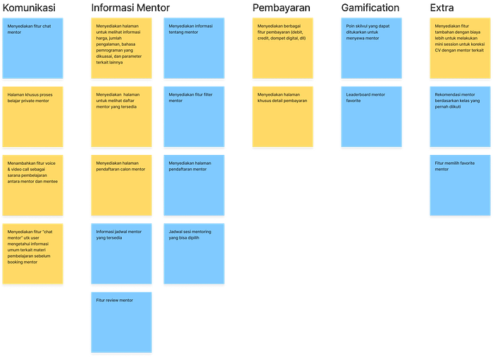
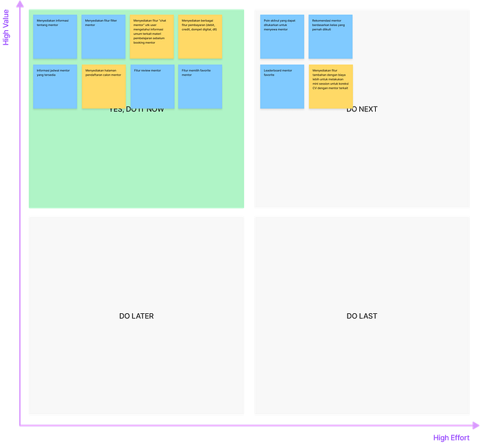
In this phase, we brainstorm solution ideas based on the results of How Might We. We create an affinity diagram to organize and prioritize the solutions, which one should be executed at first.
Affinity Diagram

Prioritization Idea

Phase 4: Prototype
To better understand what users need, we make user flow, to make design more efficient and less effort for users.
User Flow

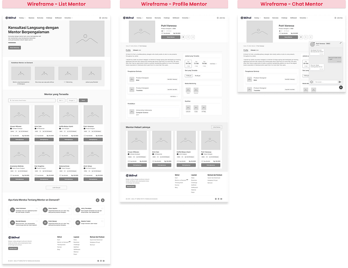
Wireframe
From the user flow, we create the wireframe. We highlight the 3 pages, Mentor List, Mentor Profile, and Chat Mentor.

Design System
We create a UI design system to help us focus and be consistent with the design style of Skilvul.

High-Fidelity Design
We started to make High-fidelity, and we used a design system to make design faster and more efficient.

Prototype
A prototype is needed to make users interact with the High-fidelity design and get their feedback after it is finished. This prototype contains 4 flows such as registration, finding a mentor, chatting with a mentor, and booking a mentor.
Phase 5: Testing
Usability Testing
To validate the design and its features, we performed usability testing with System Usability Scale (SUS) as a usability metric. We performed Survey via Google form with several potential users. Using the prototype, we provided four tasks that should be completed by the participants, such:
- Register and Login to Skilvul as a Mentee
- Find a Mentor (Putri Vanessa)
- Chatting with a Mentor (Putri Vanessa)
- Booking a Mentor

There are several studies that show the average SUS is 68. Therefore, if this design’s SUS score is greater than 68, it is considered above average and fits the criteria of usability and user experience. In terms of SUS scores, the design created is rated GOOD with 76.84 points. Consequently, this design achieves an acceptable or suitable grade when it comes to usability.
Hey, you made it!
Huge thanks to Skilvul, team members, and my mentor Rizki R Fikkar | Vixturistic who guided me through the process, he gave me a lot of advice and insights to be a good UIUX designer.
I learned a lot from this case study, ranging from strict time management to creating surveys and creating solutions for other people. This new thing is very tiring but very fun to implement. I have gained valuable experience in the field of UI/UX with this.
Thank you for reading! I’d love to hear any feedback from you on this article. Say hi to me at uidesign.ku@gmail.com or connect me at LinkedIn.
